


You may have noticed that the Google-owned video-sharing site’s infamous red play logo is now rendered in a softer, more pinkish hue. That’s because user research revealed that the company’s logo color rated as one of its top three most outdated design elements.
Last updated in 2017, YouTube’s old brand color was a pure red that users perceived to be “too loud when implemented in key UI moments,” Robyn Lee, YouTube’s visual design lead, said in a Google Design blog post.
The old red had other technical problems, too, like rendering orange on some screens and causing a burn-in effect on TVs—a major issue considering YouTube TV’s rapid growth. But with the color so central to the platform’s brand identity, designers had to be thoughtful about making a change.
To pick the new red, which began appearing on the site several months ago, YouTube’s design team looked for colors that fit the company’s creative principles of being welcoming, engaging, dynamic, and unified. They “stayed away from colors that felt domineering, cold, or corporate,” product manager Linda Hong said, and settled on a more mellow shade.
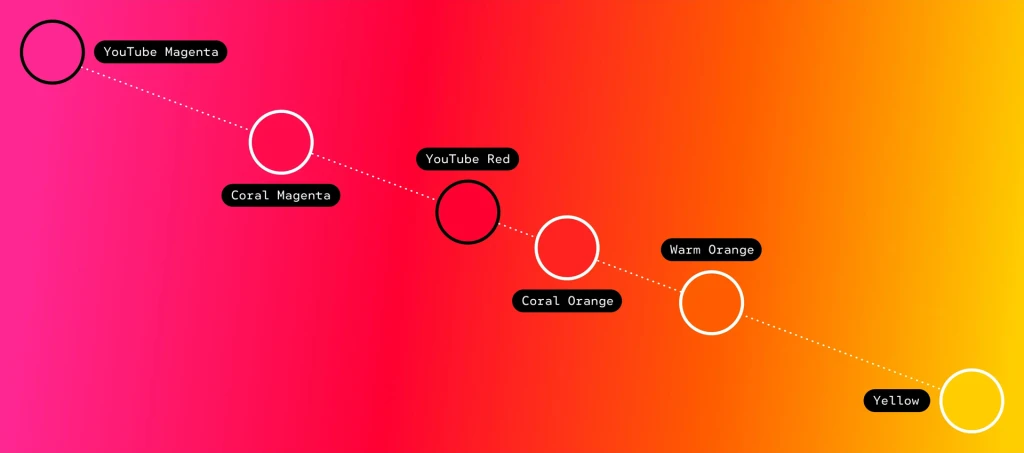
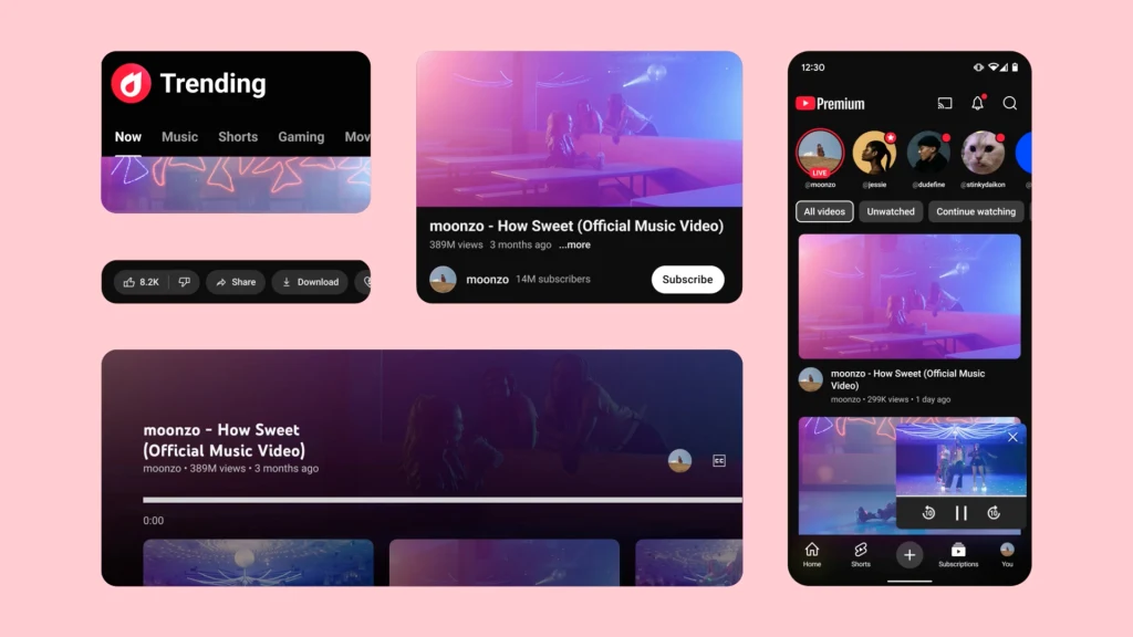
Designers also implemented a new red-to-magenta gradient and were mindful of how often red appears on the site. By limiting it to specific brand marks and UI applications, like the flame icon for “Trending” videos and and a fireworks animation that’s activated when users click the like button, it’s less overpowering.
“Red is synonymous with YouTube, but if it’s used everywhere, its power is diluted,” said visual design lead Amy Yip. “The red should be special and unique and limited to specific areas.”
It’s a subtle color shift that keeps one of the brand’s core visual identifiers intact but adapts it for the needs of modern audiences in just the way you might expect from a video-sharing site: It’s easier on the eyes.

